Why is myGYB so great?
1. Easy Communication
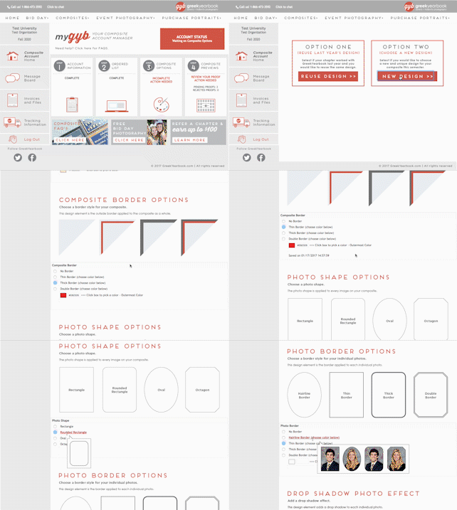
You can easily enter your Ordered List of how you want members to appear on your sorority composite or fraternity composite. If you want to make changes to your Ordered List after you’ve submitted it, all you have to do is post on the myGYB Message Board to talk with your designer and make edits.
You have complete control over the design and can choose colors, borders, fonts, frames, and more all within your myGYB account.
After you submit your design options, you will receive your first online proof. From there you can make design edits and view as many proofs as you need. We provide free unlimited design changes and proofs for your review.
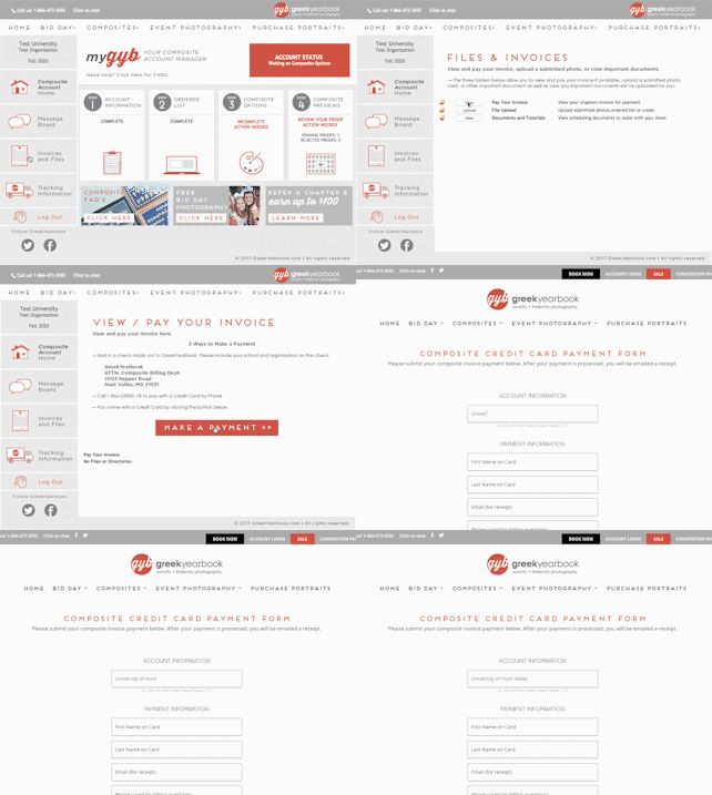
You can view your invoice and balance within your myGYB account and then conveniently make payments online!
Composite Design Tips
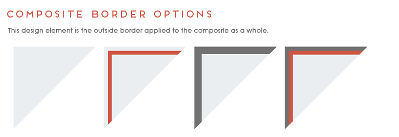
1. Composite Background and Borders
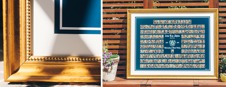
Choosing colors can be tricky without any guidelines or tips. We recommend that you reference previous composites or use your organization’s branding colors. Get hex color codes for your background and border colors. Enter the hex colors into myGYB to ensure the perfect color match for your sorority or fraternity composite. Also, make sure you choose contrasting colors for your background color and border color so the border stands out as a nice enhancing detail.
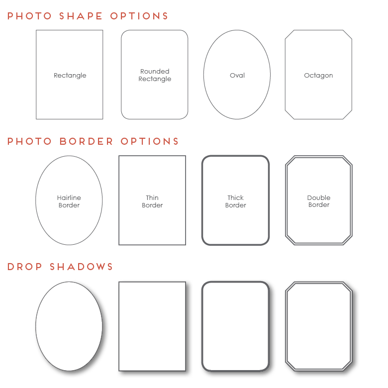
2. Photo Shapes, Border Options, and Drop Shadows
We offer four different photo shapes for your composite: rectangle, rounded rectangle, oval, or octagon. Most sororities choose an oval shape for their composite and fraternities often choose to use a rectangle or octagon. Photo borders are nice options to contour each photo, or you can go without a border for a modern clean look. Drop Shadows are also a nice option that can add some dimension to your composite.
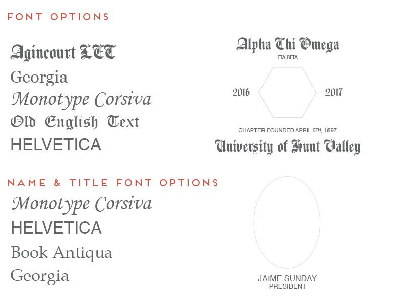
3. Fonts
The fonts you choose for your sorority composite or fraternity composite will affect the look, feel, and readability. We recommend that you choose a more detailed and intricate font for large focal points, like your Organization Name, University, and Year. Then you can choose clean simple fonts for your chapter name, founded date, member names, and titles.
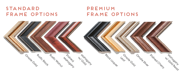
4. Matting and Framing
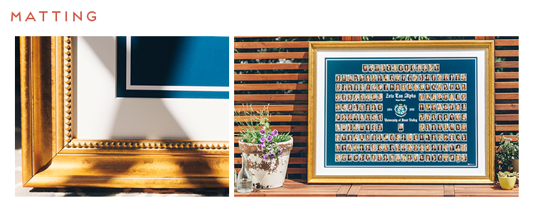
It is always good to plan where your new composite will be hung and choose matting and framing accordingly. If your new composite is going to be hung next to other composites in your sorority house or fraternity house, then choose a frame to match. Also, consider the decor and style of the room where your new composite will be hung! Custom composite matting is a recommended upgrade that adds a touch of class to your composite. And we offer a wide variety of frames, from classic to contemporary, to fit the look you’re going for.
With all of the design options available to you, we want you to feel confident and in control when creating your composite. And with myGYB, you can be in touch with your designer directly and get any questions answered. We are always committed to helping our customers receive gorgeous composites that represent their sorority and fraternity traditions.


Hello, my name is Tyler Blitz. My friends and I are looking to make a composite, however we are not affiliated with the school’s chapter. Is there a possibility if I were to collect the photos and send them over to you guys, you would be able to simply place them in the template with all of the other amenities? Also, would I be able to get a price quote for this, given its possible. Thank you so much for your help.
Hi Tyler, thank you for your comment! Our Business Development Manager will be in touch soon!
Hi! I was wondering if I was to take all of the photos myself and send them to yall would you be able to place them in a composite for me? If possible I would also love a quote on this. Thanks!
Hello I am also wondering if I were to collect the photos and send them over to you guys, if you would be able to simply place them in the template with all of the other amenities? Also, would I be able to get a price quote for this, given its possible. Thank you so much for your help. Also- do you ship to Canada?
Hi Josie! Thank you for getting in touch. Our Business Development Manager will email you shortly 🙂
I’m going to put together a composite for my son’s fraternity. Do you have the crest / logo for Phi Mu Alpha Sinfonian?
Hi Rebecca, someone in our production department will be emailing you shortly! I apologize for the delay and thank you for your patience!
Hi, myself, along with about 25 other males have formed a society and we would like a composite made for us. How exactly could this work?
Hi Marquis! Thank you for reaching out regarding your composite needs. Our Business Development Manager will email you shortly
Hi! I was reaching out because I wanted to make a composite of my friend and I. We are not fraternity affiliated. Was wondering what my options are.
Hi! I would like to create this for a class of 74 nursing students. Could you please email me with a cost estimate for a photo and frame to be placed in our hall of nursing classes? Could you do something framed as small as 8×10? Or what sizes could be available? What if students wanted to purchase the photo of their class- how much would individual photos of the class cost please?
Hi! Yes, we can absolutely send you some options and information. Your message has been forwarded to our Business Development Manager and someone will get back to you soon! 🙂
Hi We are looking for a composite for a 40+ member fraternity.
Sounds great! Someone from our Business Development team will reach out to you shortly 🙂
Hi! I am trying to create a composite for my organization – there will be around 100 people on it. We have already taken professional photos for every member, and would like to order 11” by 14” composites. I was wondering if I could get an estimate for how much it would cost!
Hi! That sounds great. A member of our Business Development team will email you today with some more information!
Hi! I am trying to create a composite for my sorority and was wondering if I can just send the photos over and have it placed in the template? I was also wondering how much this process would cost
Thank you for reaching out! A business development associate will be in touch 🙂
Hello I am also wondering if I were to collect the photos and send them over to you guys, if you would be able to simply place them in the template with all of the other amenities? Also, would I be able to get a price quote for this, given its possible. Thank you so much for your help.